client /
KIOENE
JOB /
From family butchers to plant-based pioneers, Kioene evolves with a bold, clean identity that mirrors our commitment to a conscious future. Our new look turns every pack into a storytelling tool, blending 35 years of heritage with a fresh, planet-first mindset. It’s innovation rooted in history, designed for the modern table.
the brief:
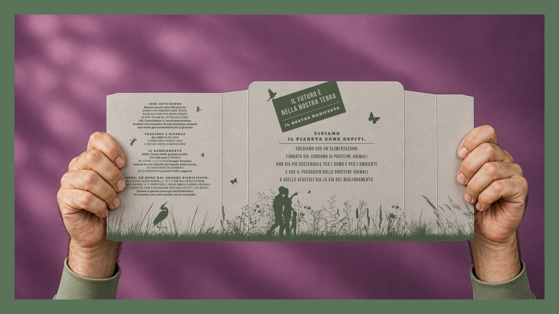
Kioene is one of Italy’s leading producers of plant-based foods. Founded in Padua in 1988 by Albino and Stefano Tonazzo, the company has a unique story within the food industry: a family of entrepreneurs with generations of experience in the meat sector who chose to invest decisively in the plant-based world, anticipating a shift that would transform the eating habits of millions of people. Today, Kioene is Italy’s leading producer of plant-based ready meals and delicacies, with over 35 years of experience and a pioneering role in the alternative protein market. The company originally launched under the name BIO-ENE, which later became Kioene in 2013. The name carries a profound meaning: in ancient Eastern cultures, “Ki” represents the vital energy of the individual, “O” symbolizes the circle and universal harmony, while “ENE” evokes the energy of the planet and all its inhabitants. Together, Kioene expresses the idea of an individual’s energy living in harmony with the world around it.
strategy:
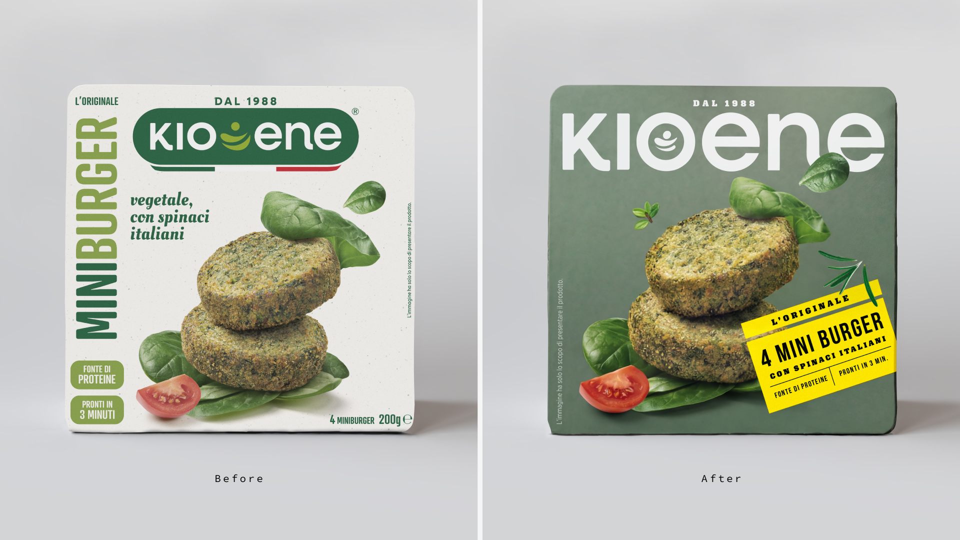
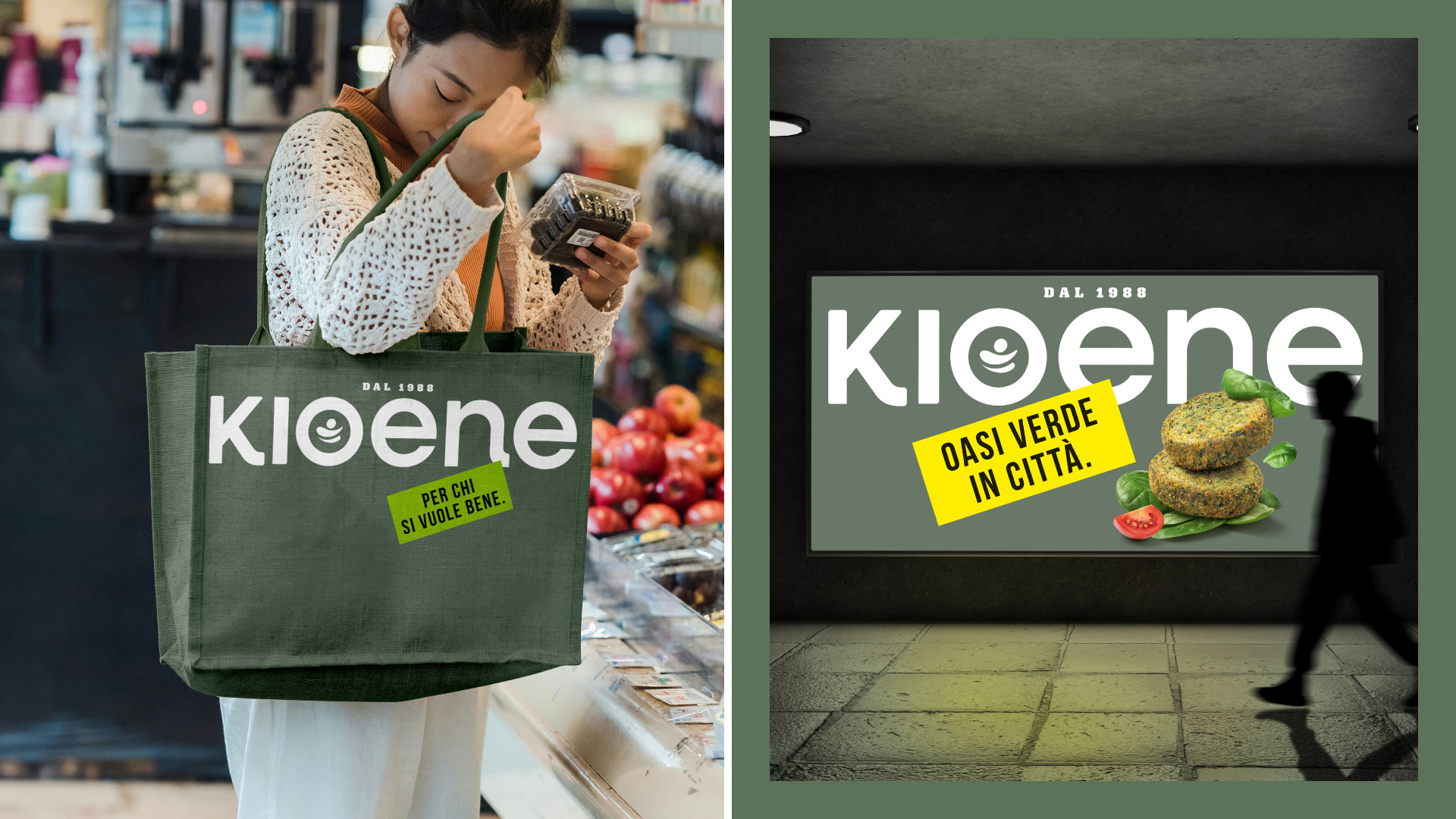
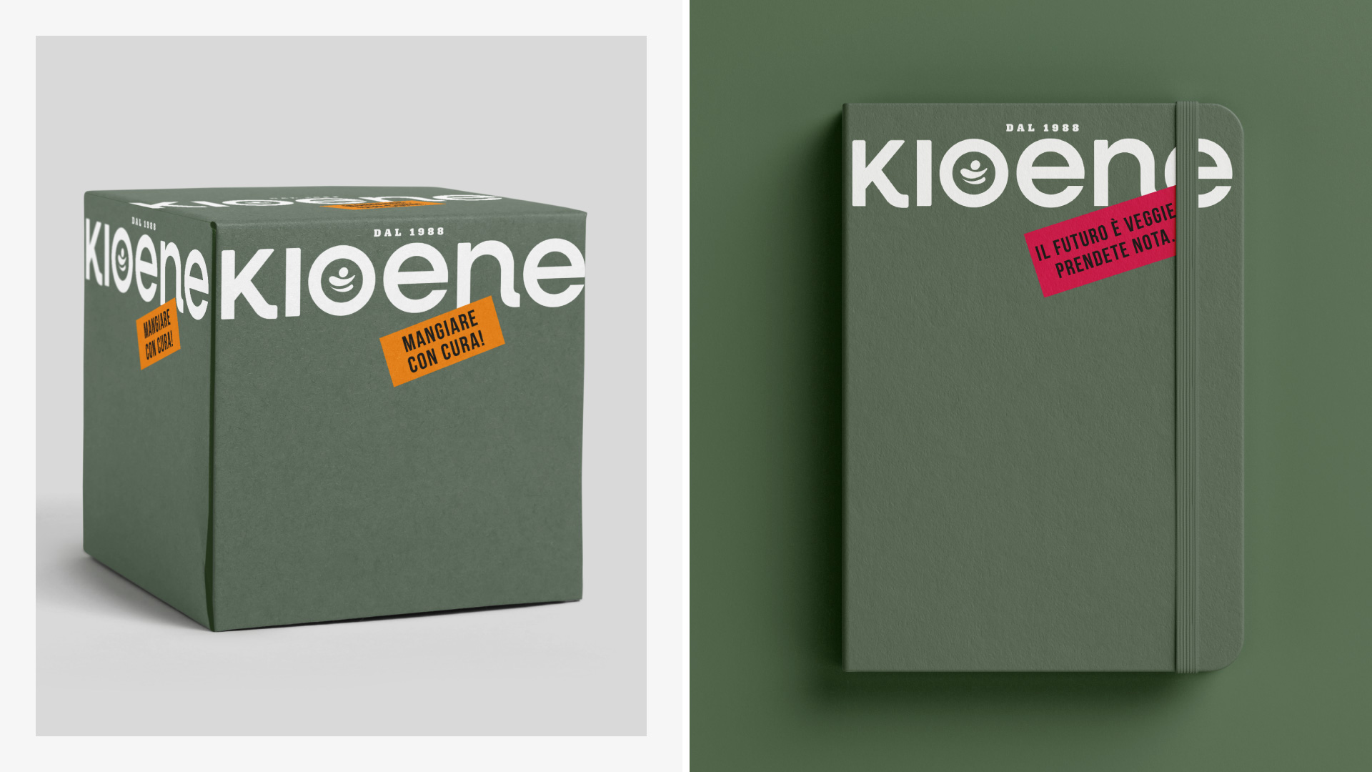
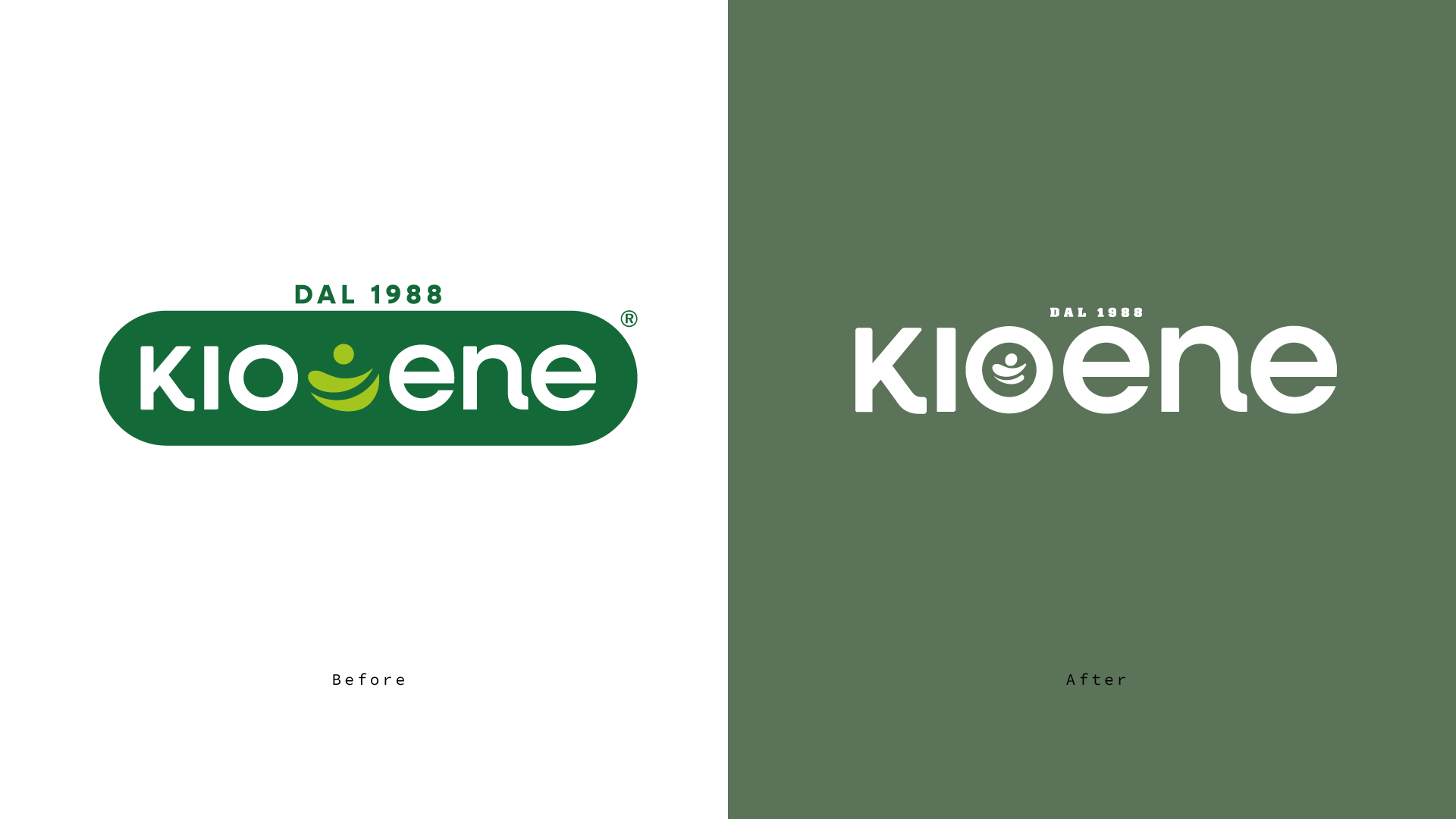
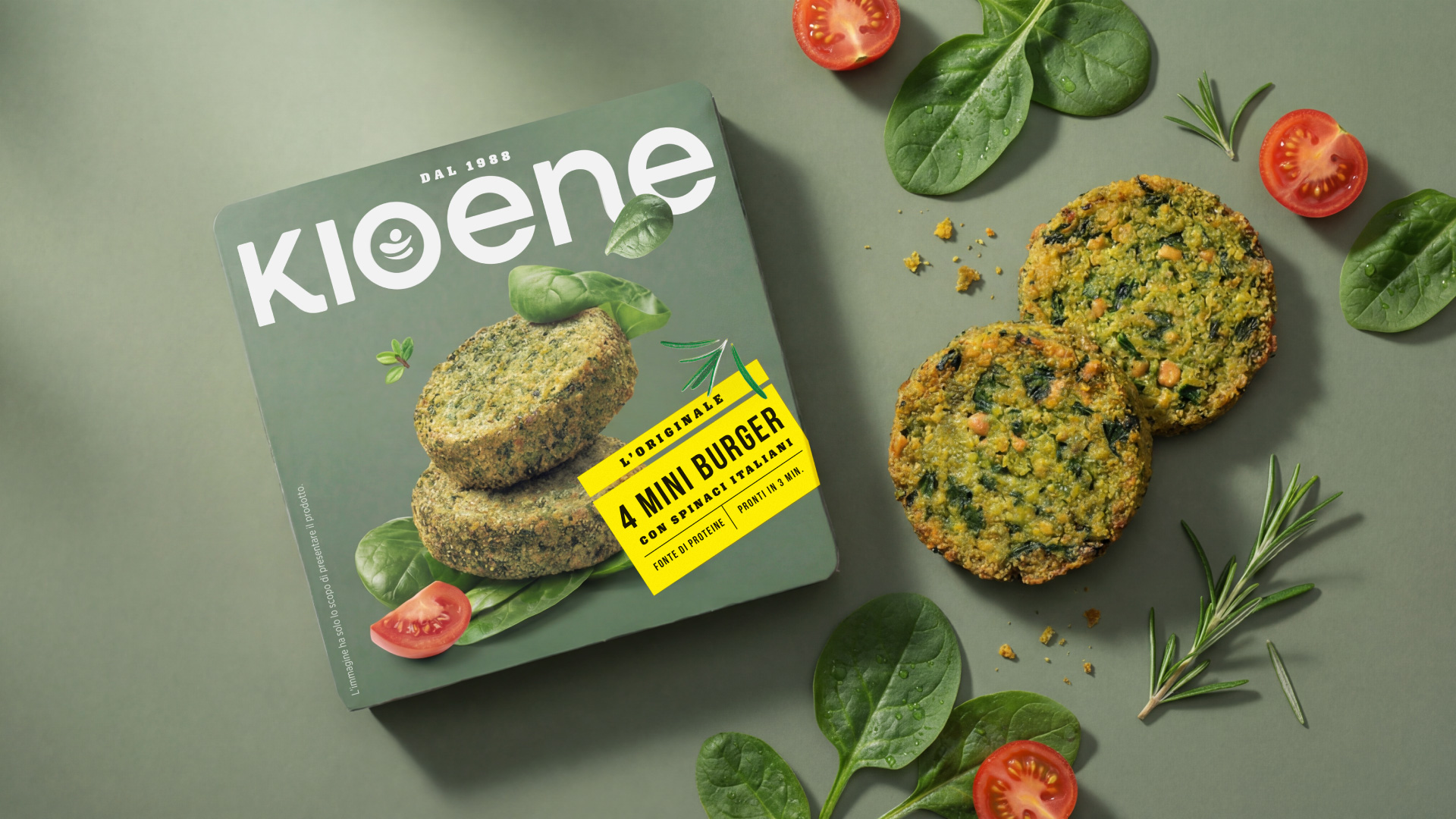
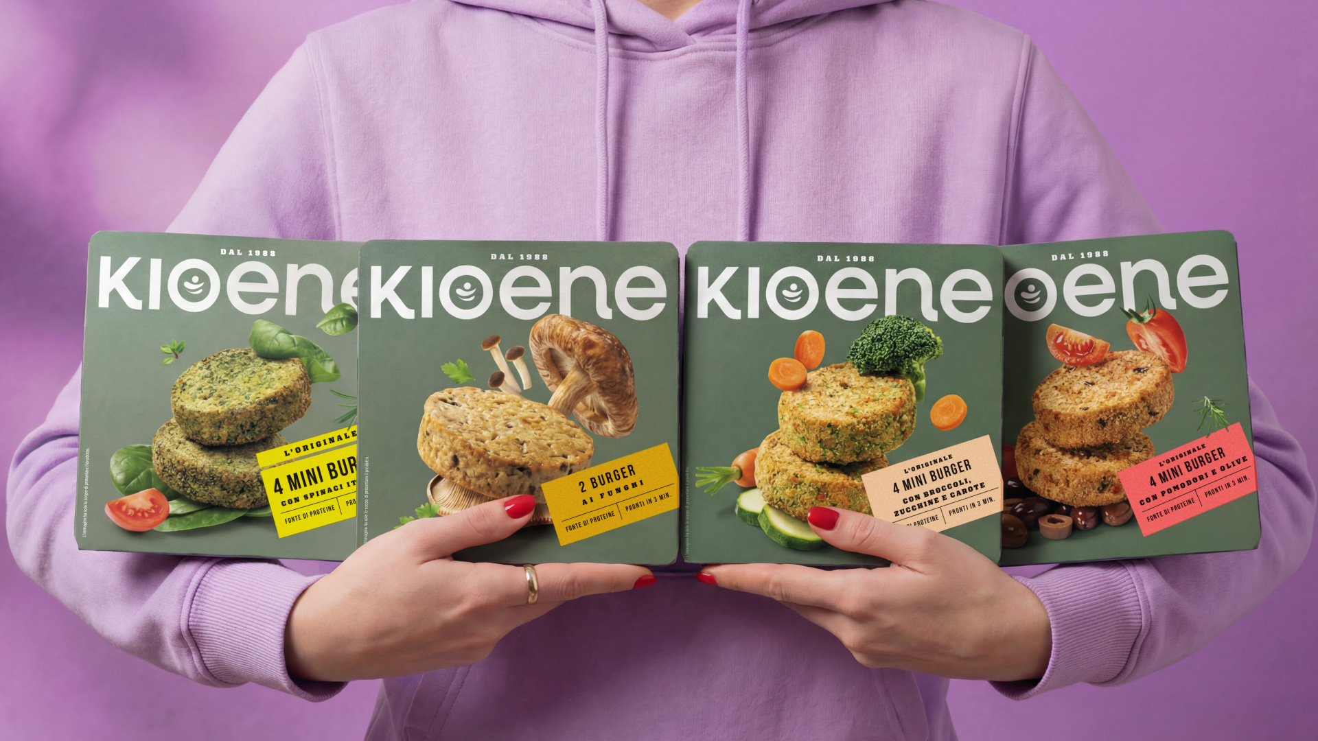
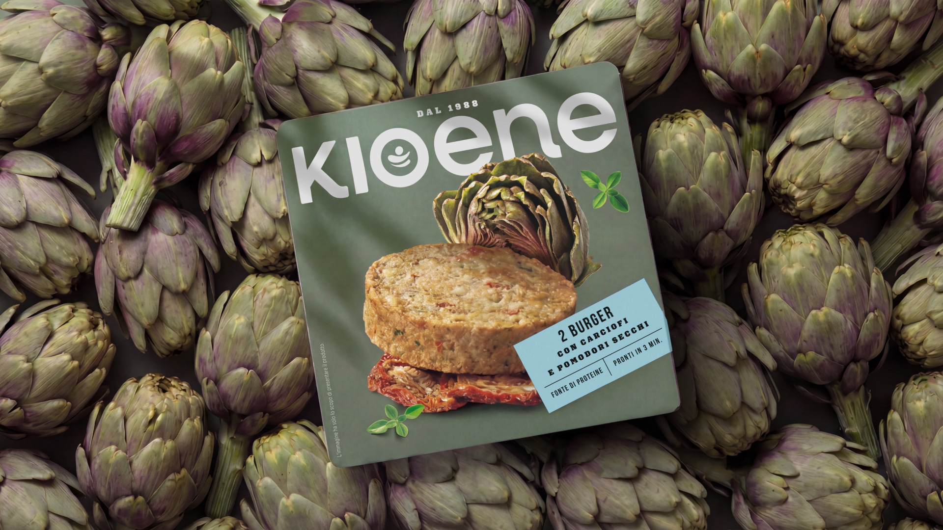
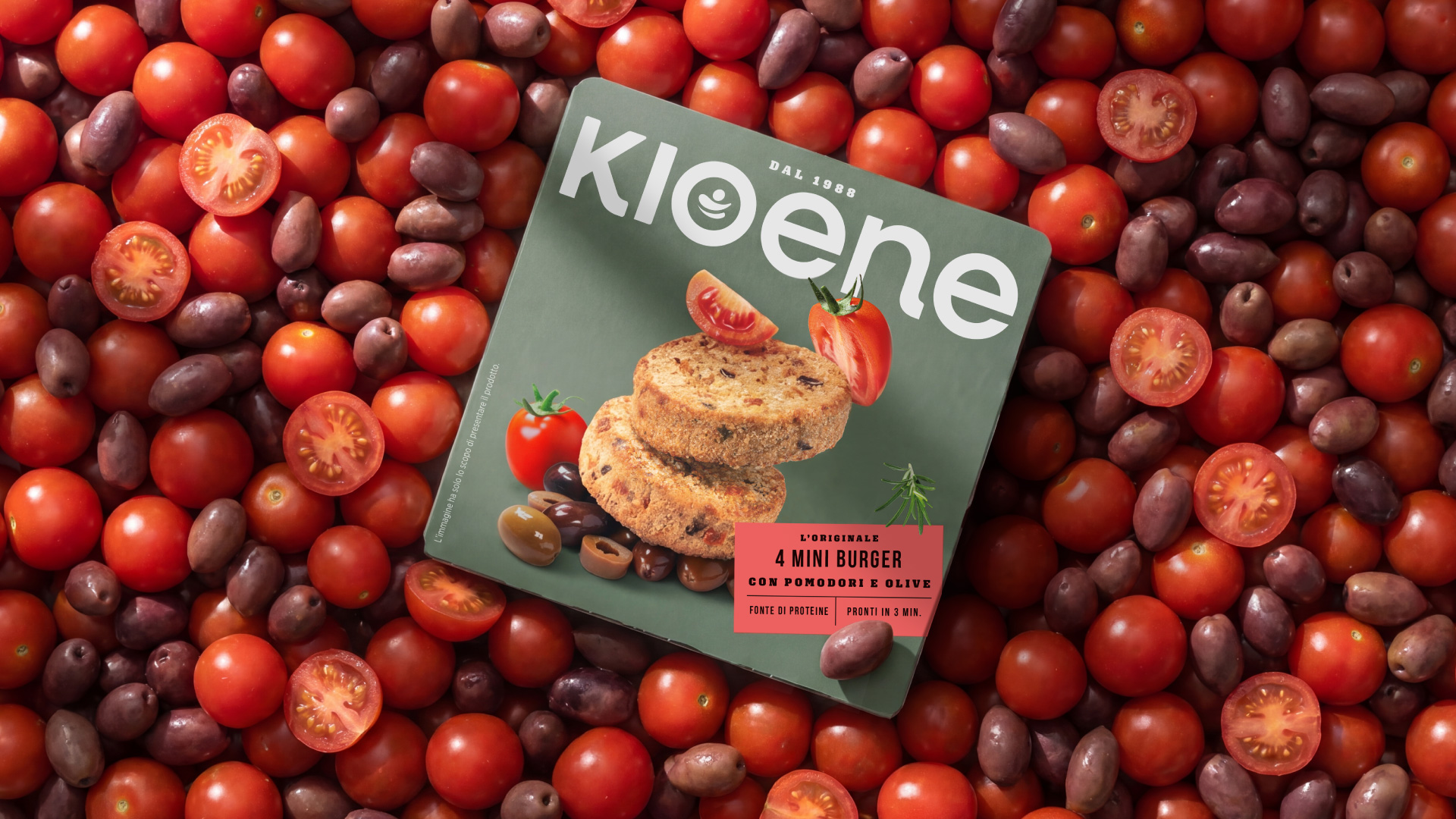
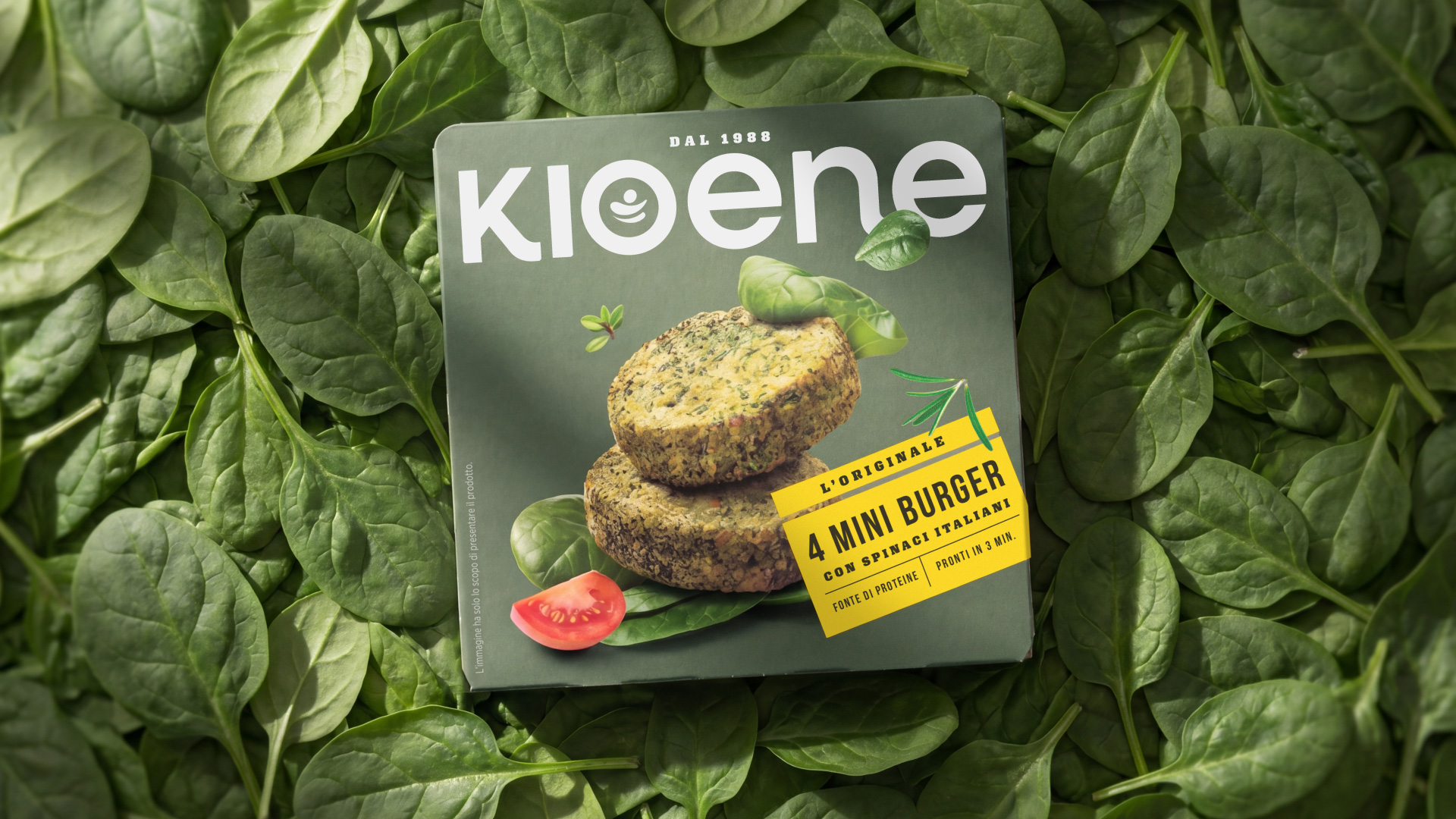
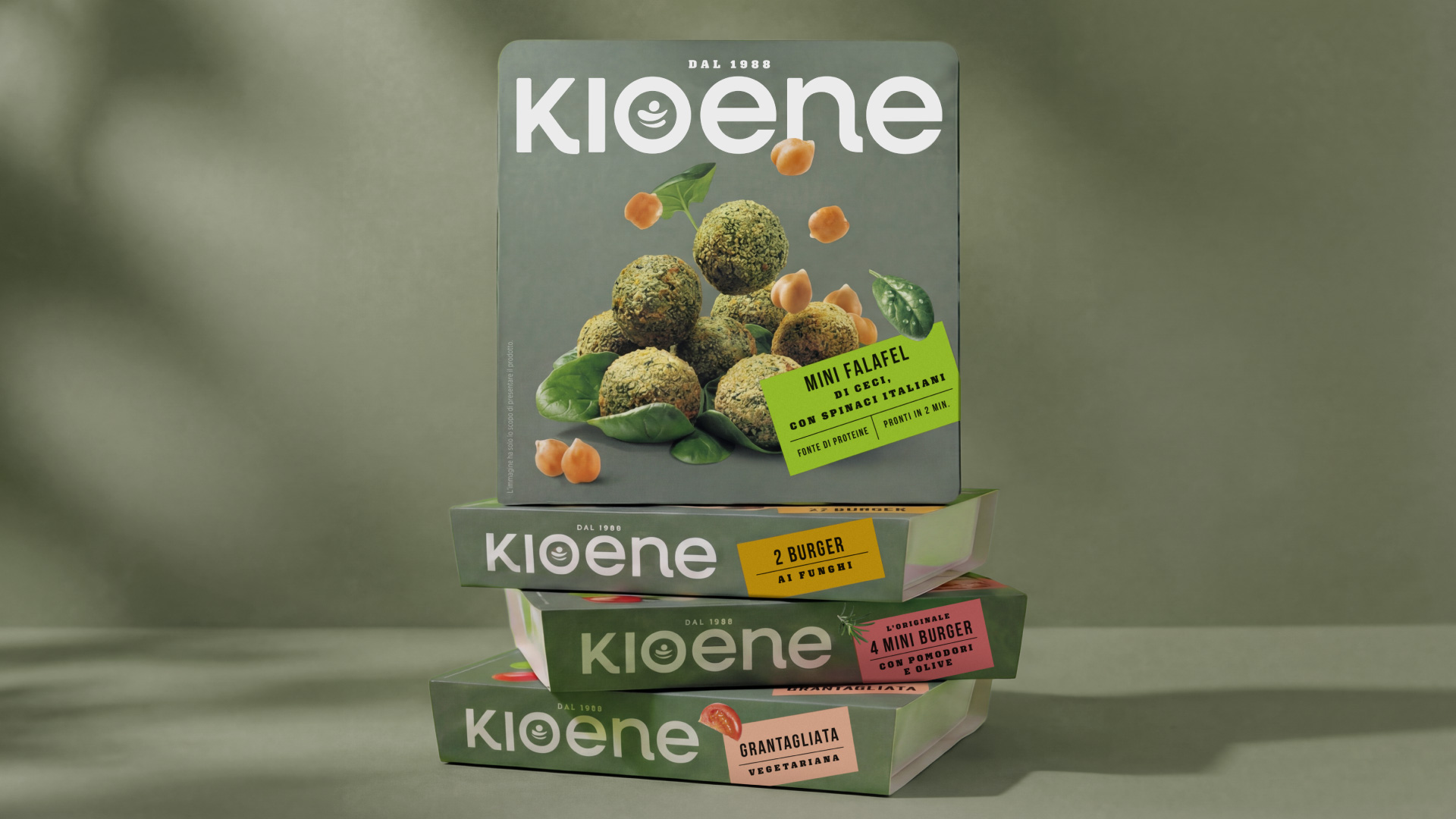
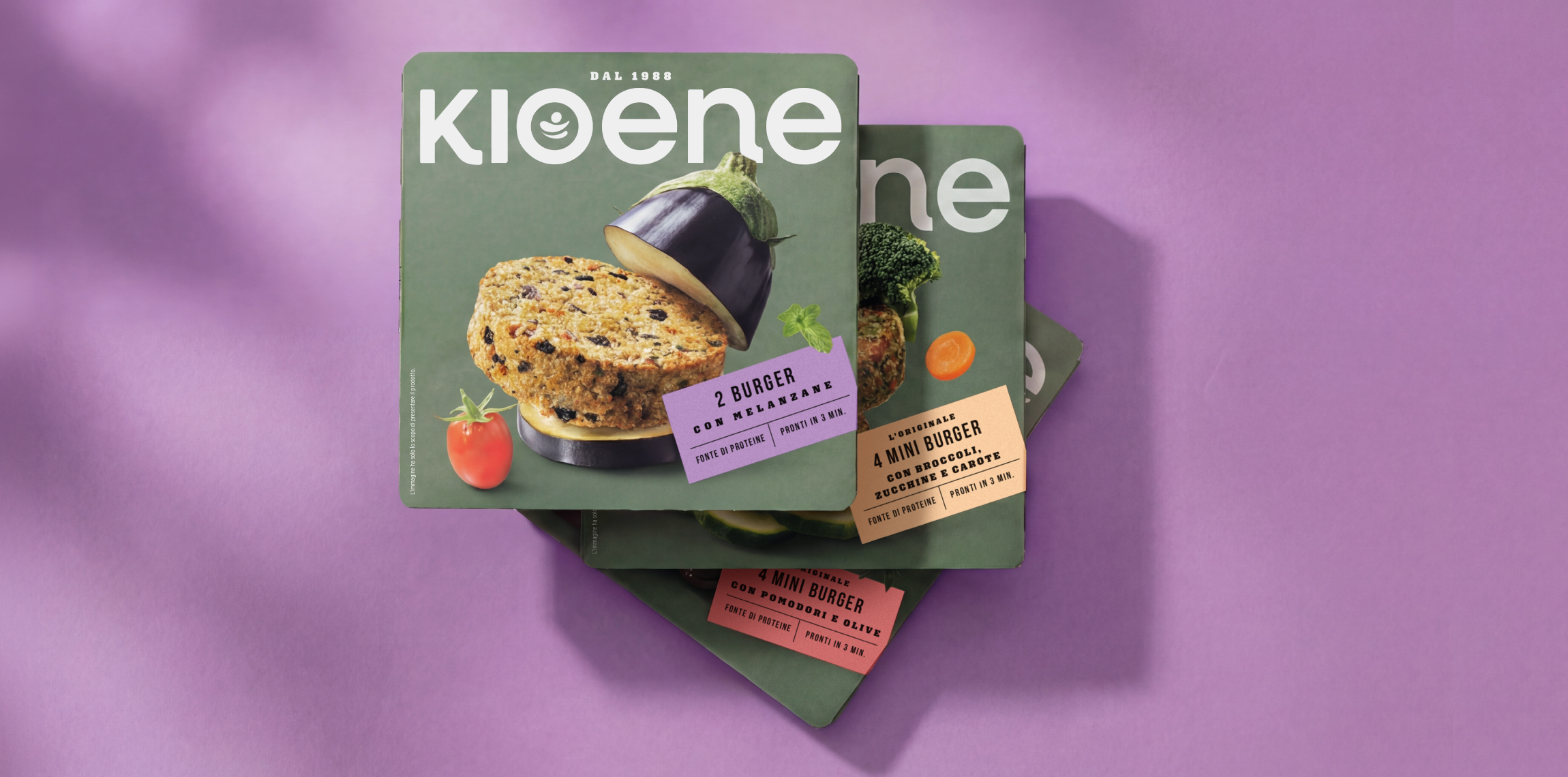
The new brand identity was developed to reflect the company’s growth journey and to more clearly communicate its commitment to a responsible, conscious, and future-oriented approach to food. The new brand identity and packaging system, designed by NEOM | Brand Design Studio, celebrates Kioene’s history of innovation and transformation through a more distinctive, contemporary, and recognizable visual language. The packaging becomes a storytelling tool, communicating the brand’s values through a clean graphic approach, strategic use of color, and the enhancement of the “embrace” icon, a symbol of the connection between people, nature, and animals. One of the main limitations of the previous identity was the logo itself, which was split into two separate words — “Kio” and “Ene”. This structure reduced readability and weakened brand recall. For this reason, the logo was redesigned as a single wordmark — KIOENE — strengthening both recognition and memorability. The embrace symbol was carefully redrawn and refined before being integrated into the “O”, transforming it into a central element of the identity while reinforcing the symbolic meaning behind the brand. To maximize shelf impact and improve brand recognition, the logo was given a dominant role across the entire front of the packaging. Combined with the use of a distinctive proprietary brand color, this approach creates a strong block effect at shelf level, enhancing visibility across the entire range and generating an immediate “brand wall” effect. Product information is organized within a dedicated reference label system, designed to maintain visual order and clarity while making it easier for consumers to navigate the range and quickly identify individual products. The new design embraces a visual language built on simplicity, clarity, and immediacy. It is intended to engage both the brand’s established audience and younger generations, who are increasingly conscious of nutrition, wellbeing, and the environmental impact of their everyday choices. An important role is also played by the new storytelling sleeve, which recounts the company’s journey from its origins in the family butcher shop founded in 1888 to the bold decision by the Tonazzo family to leave meat production behind and fully embrace the plant-based category. It is a story of transformation, adaptability, and the belief that even an everyday act such as grocery shopping can contribute to a more conscious and sustainable food system. As Cristian Modolo, Marketing Director at Kioene, explains: “With this new logo and packaging, developed together with NEOM | Brand Design Studio, we wanted to express who we are today and where we are heading. We are a company that has evolved without losing its identity, preserving the value of its roots while transforming it into innovation. We want every package to communicate not only the quality of the product but also the values it stands for: respect for nature, people’s wellbeing, and responsibility towards the planet.”
less...
More...