client /
MICROMOLES
JOB /
Micromoles is an Argentine company recognized for its strong commitment to developing chemical solutions that respect the environment on a global scale. The company stands out for its dedication to delivering high-quality products, innovative solutions, and forward-thinking technologies to clients worldwide. Its ability to adapt quickly to changing market demands and emerging technologies is what allows Micromoles to remain at the forefront of sustainable innovation. To achieve this, Micromoles continuously explores and integrates the latest advancements—both locally and internationally—tailoring its products to meet the specific needs of each market and customer.
the brief:
The goal was to redefine the brand’s visual and verbal language — keeping a subtle connection with its past while opening it up to a new era of innovation. The new identity needed to capture the company’s forward-thinking spirit, its ongoing research, and its deep focus on the chemistry of elements that drive its work. At the same time, it had to mirror Micromoles’ natural ability to adapt — crafting each solution around the specific needs of every project, client, and market it touches.
strategy:
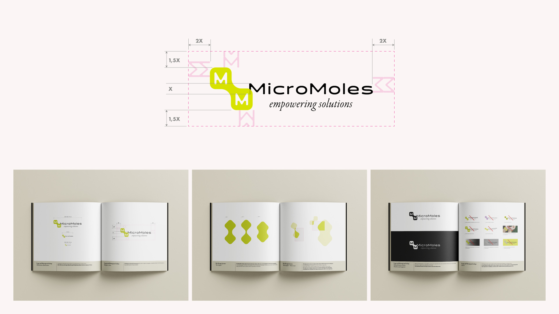
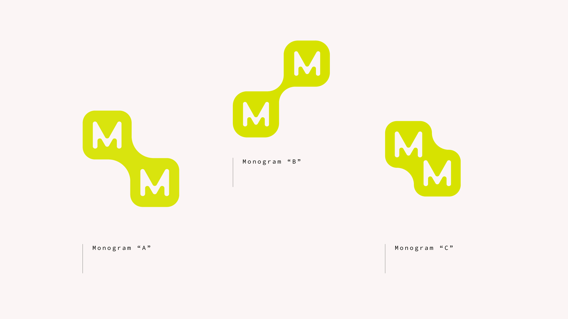
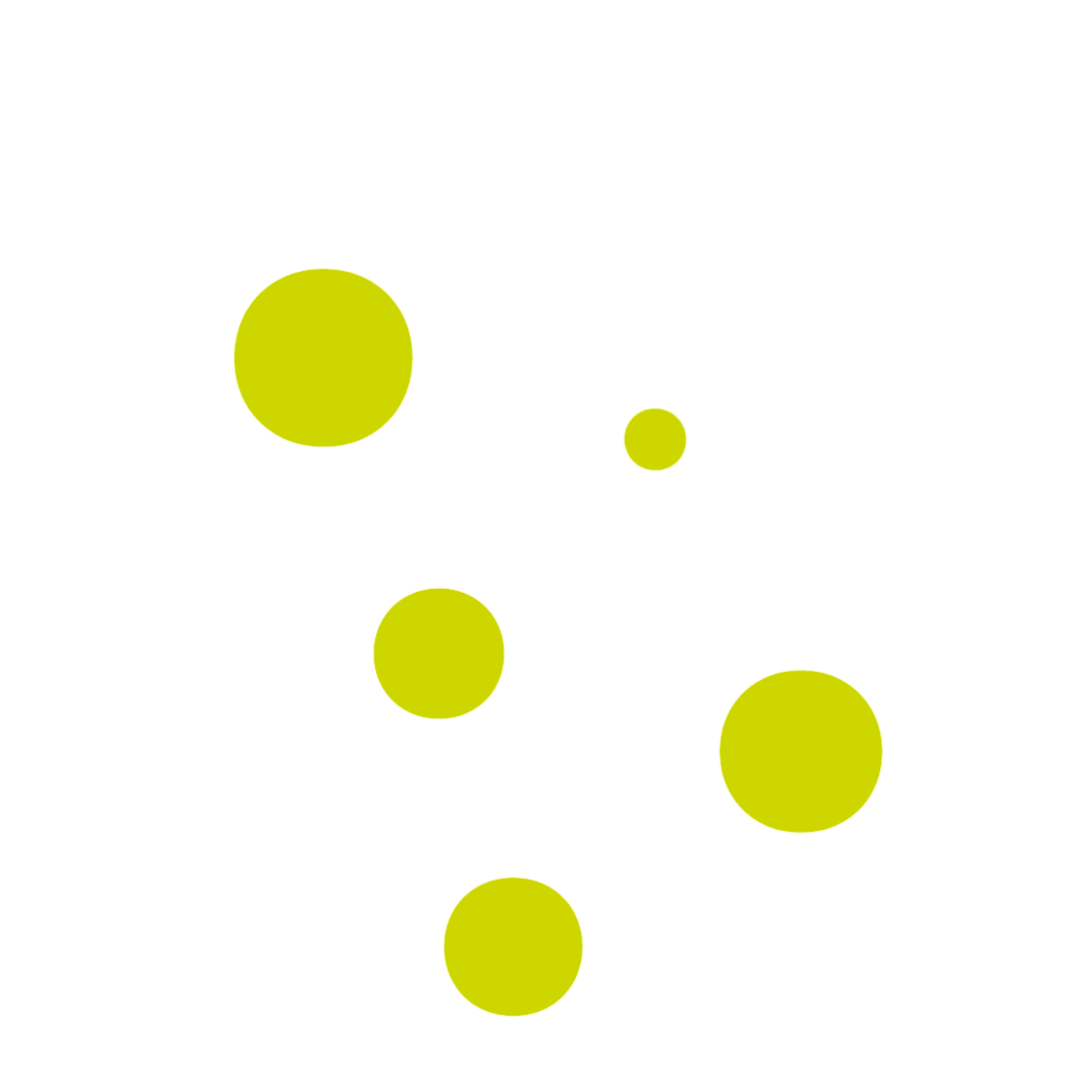
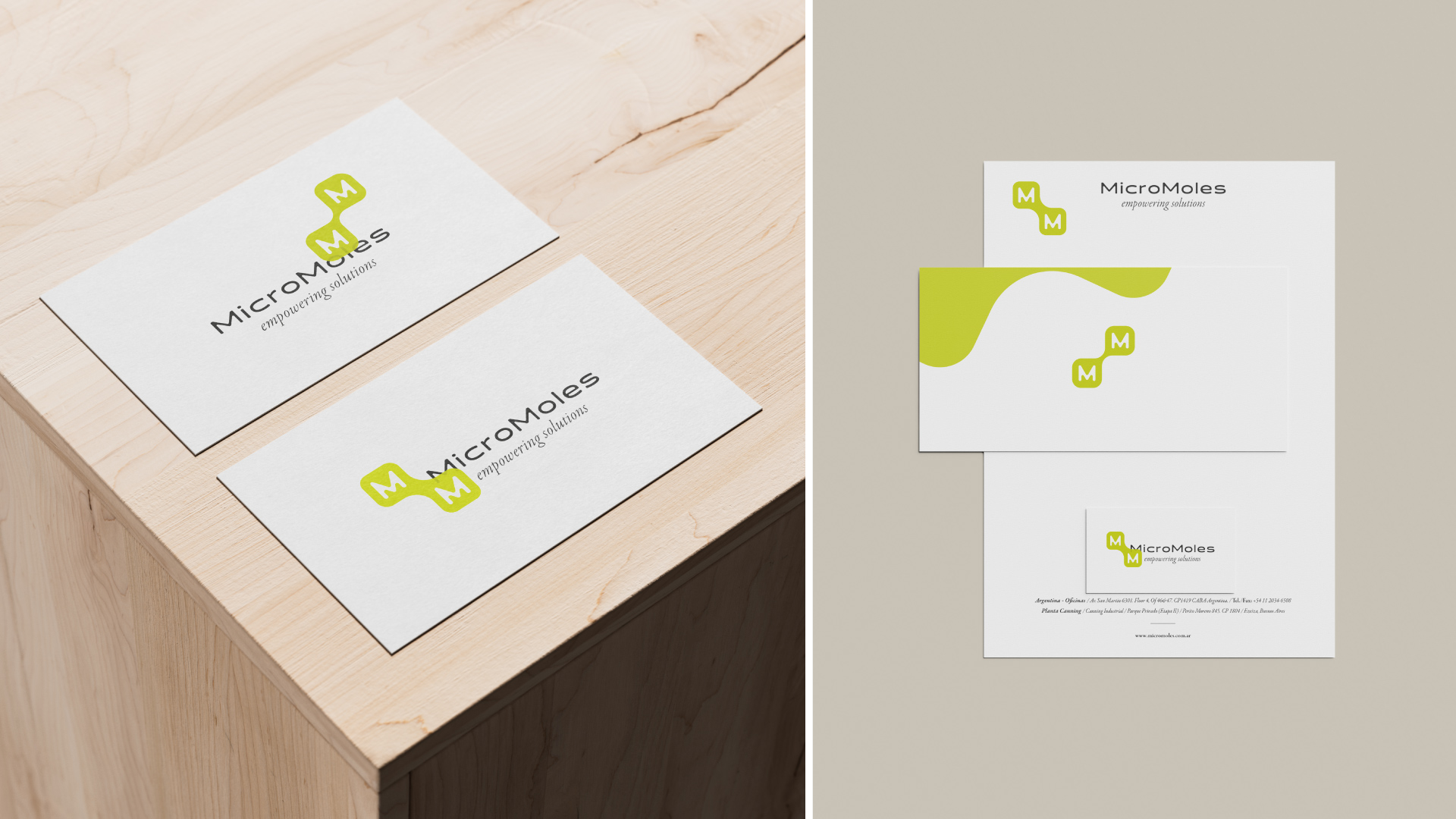
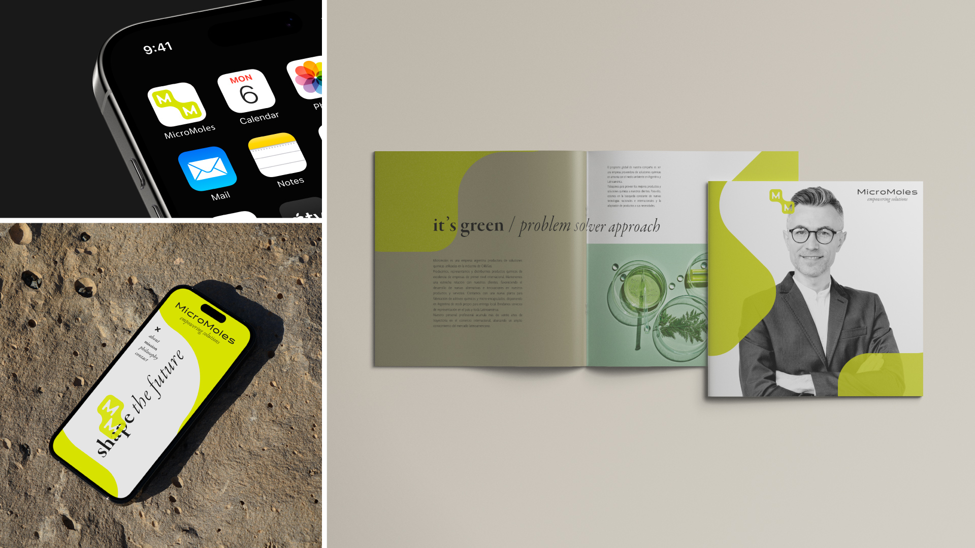
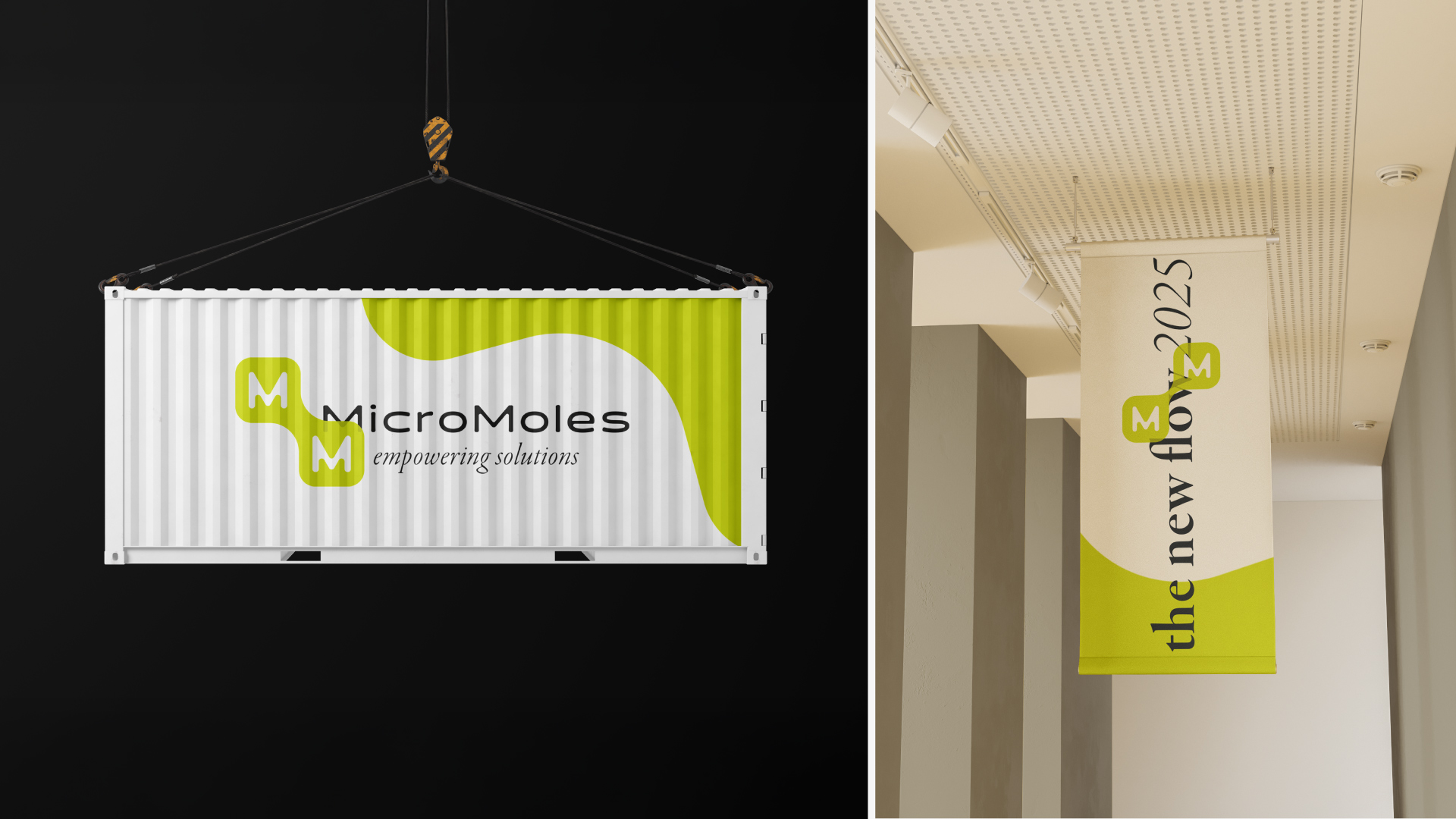
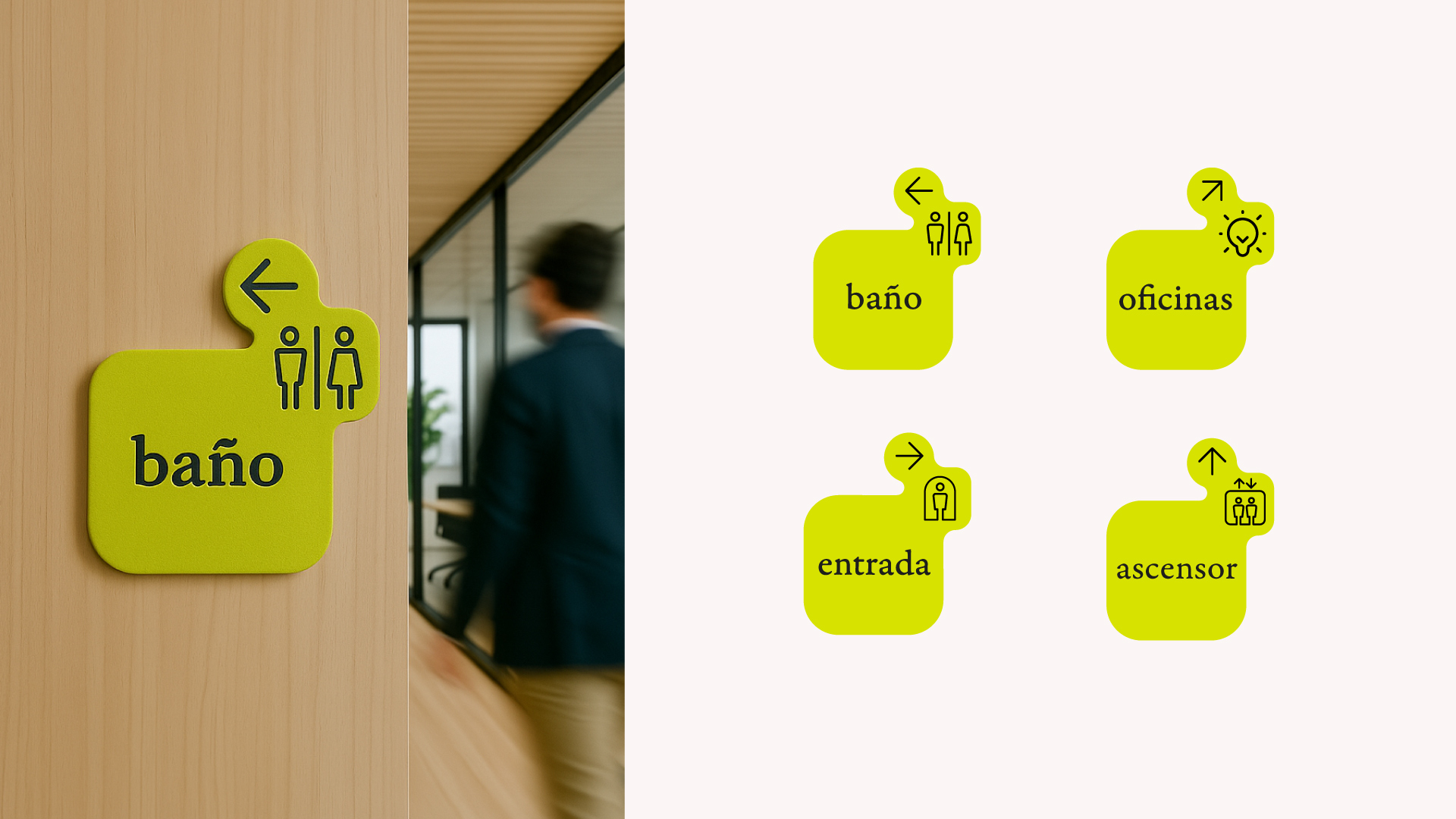
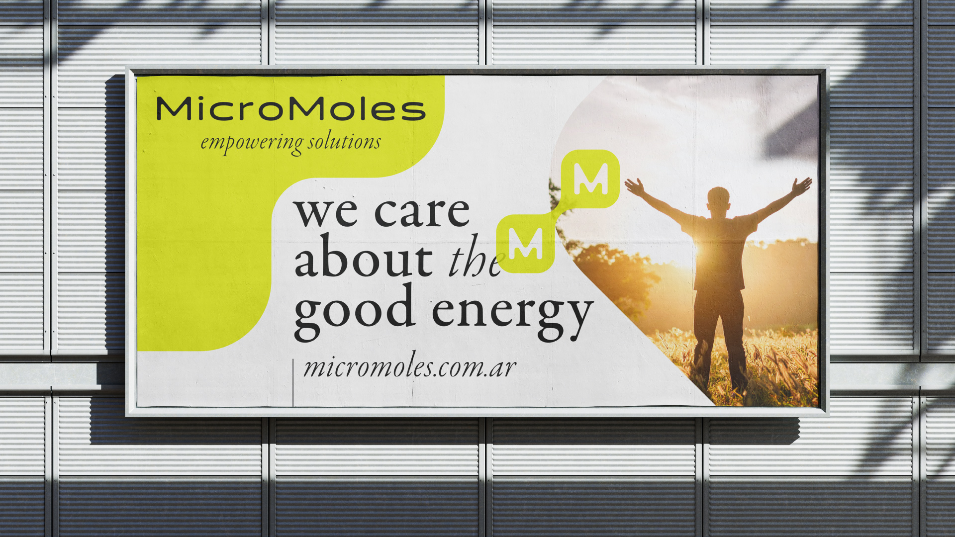
We started from the existing identity with the goal of realigning it with the brand’s true DNA. From this foundation came the idea to reinterpret the “M” monogram — no longer just a reference to the periodic table, but as two molecules in constant transformation, a symbol of movement and evolution. We then developed three variations of the monogram, designed to adapt to more traditional applications. In parallel, we created a video logo, ideal for digital environments such as social media and the web — a space where the idea of continuous evolution could come to life in a dynamic and immediate way. At the same time, it became essential to highlight another core aspect of Micromoles: its ability to innovate while staying in harmony with the environment. The color palette draws inspiration from nature, featuring a vibrant green and a warm, welcoming beige. The use of black for the logo and the strong presence of white help maintain a professional and scientific tone, balancing precision with freshness. Chemical elements, adaptability, constant research, and a world in motion — these are the values that the new Micromoles identity communicates through its refreshed visual language.
less...
More...