client /
VICENZI
JOB /
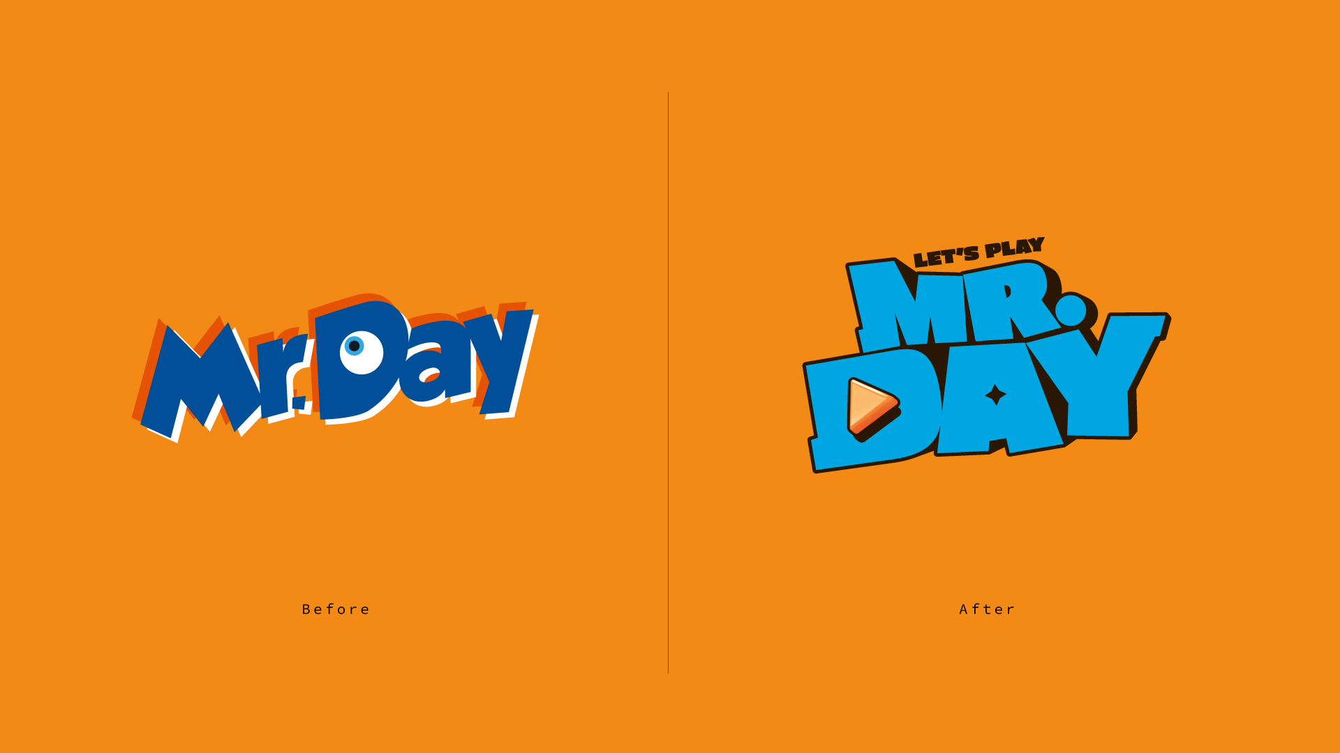
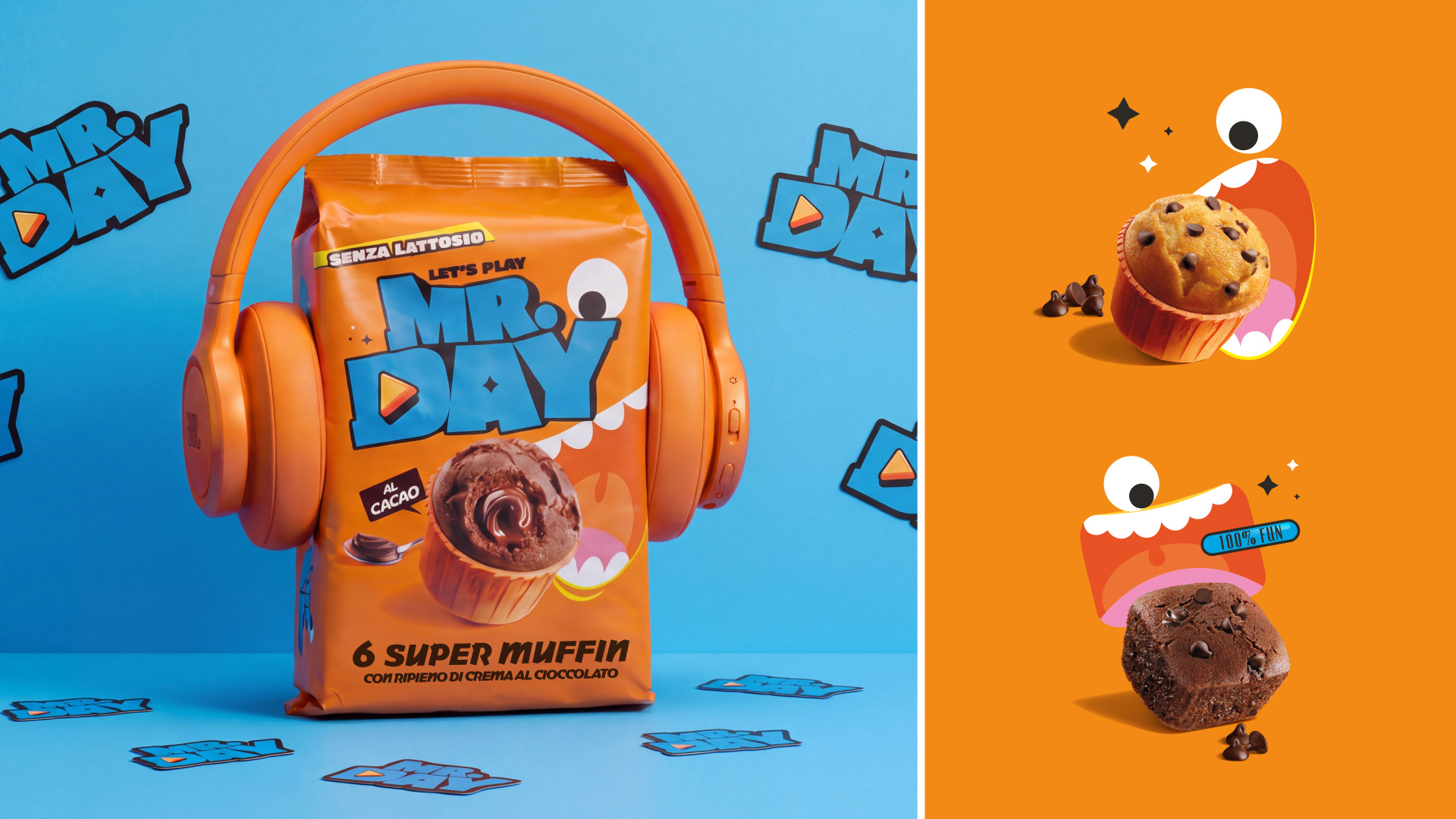
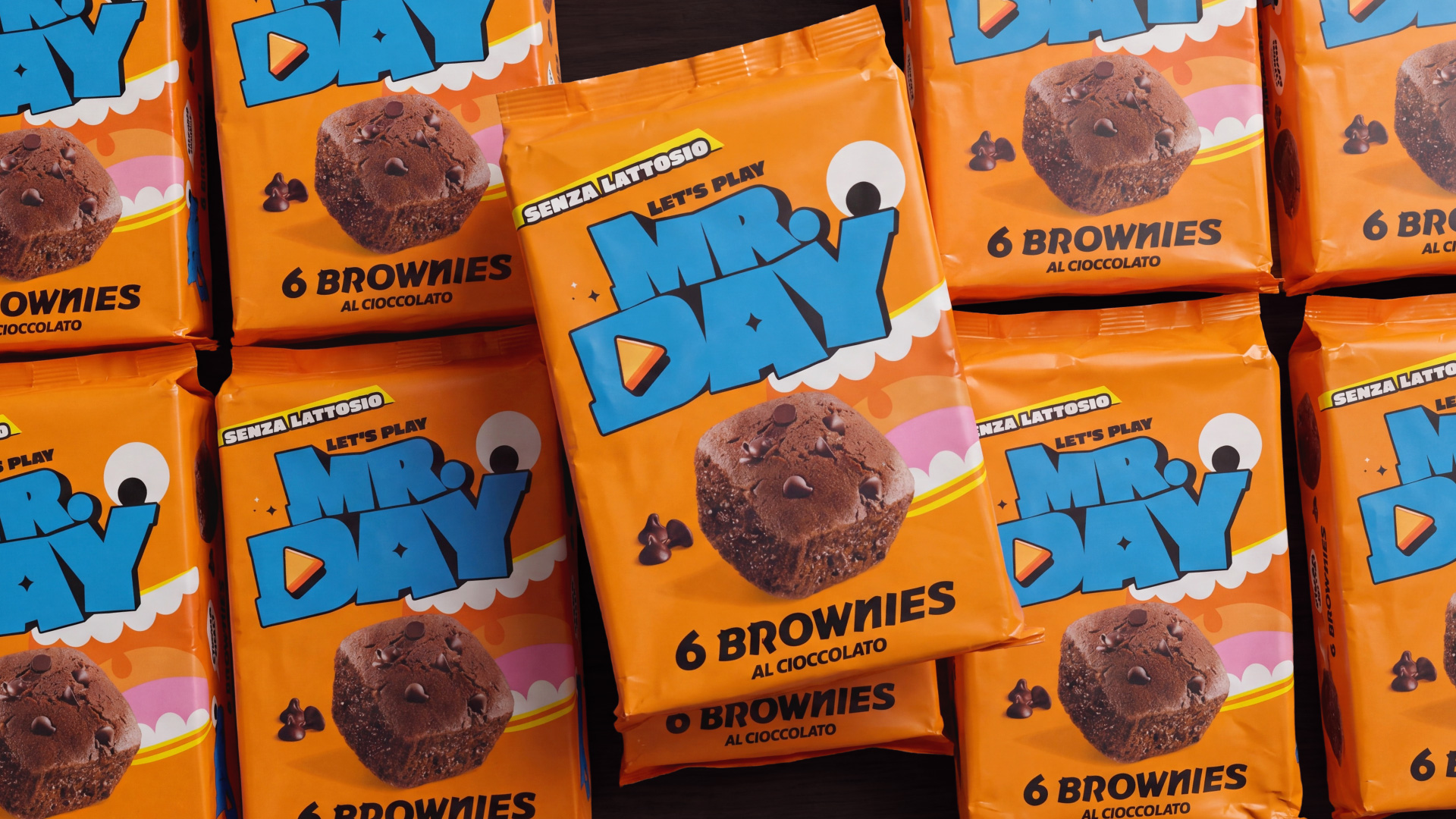
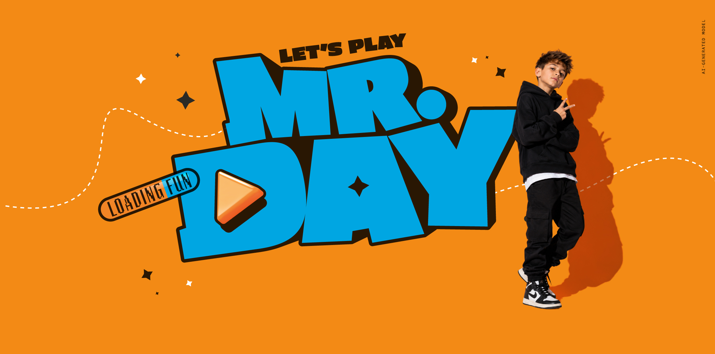
A bold new identity born from the language of a new generation — where gaming, social culture and self-expression collide. Orange becomes an attitude, packaging becomes a character, and every touchpoint is designed to move naturally from shelf to screen. Playful, inclusive and unmistakably Mr.Day. Not just a redesign. A whole new game.
the brief:
In 2010, we joined the re-launch journey of Mr.Day, a brand that had been acquired by Vicenzi Biscotti from Parmalat in 2005. After several difficult years, the brand was given a new opportunity, supported by strong awareness, a valuable heritage and the belief that its potential could still be unlocked. And it worked. Over the following 15 years, Mr.Day evolved continuously, learning how to engage shoppers while progressively moving closer to the younger generations. The brand learned to speak their language, understand their world and accompany them through the challenges, discoveries and everyday moments of growing up. This long journey ultimately led to a fundamental question: what if Mr.Day could stop simply communicating to young people and instead become a brand that truly belongs to them? This was the starting point for the new development launched in 2021: not another evolution of the existing brand, but the opportunity to redefine what Mr.Day could mean in the market.
strategy:
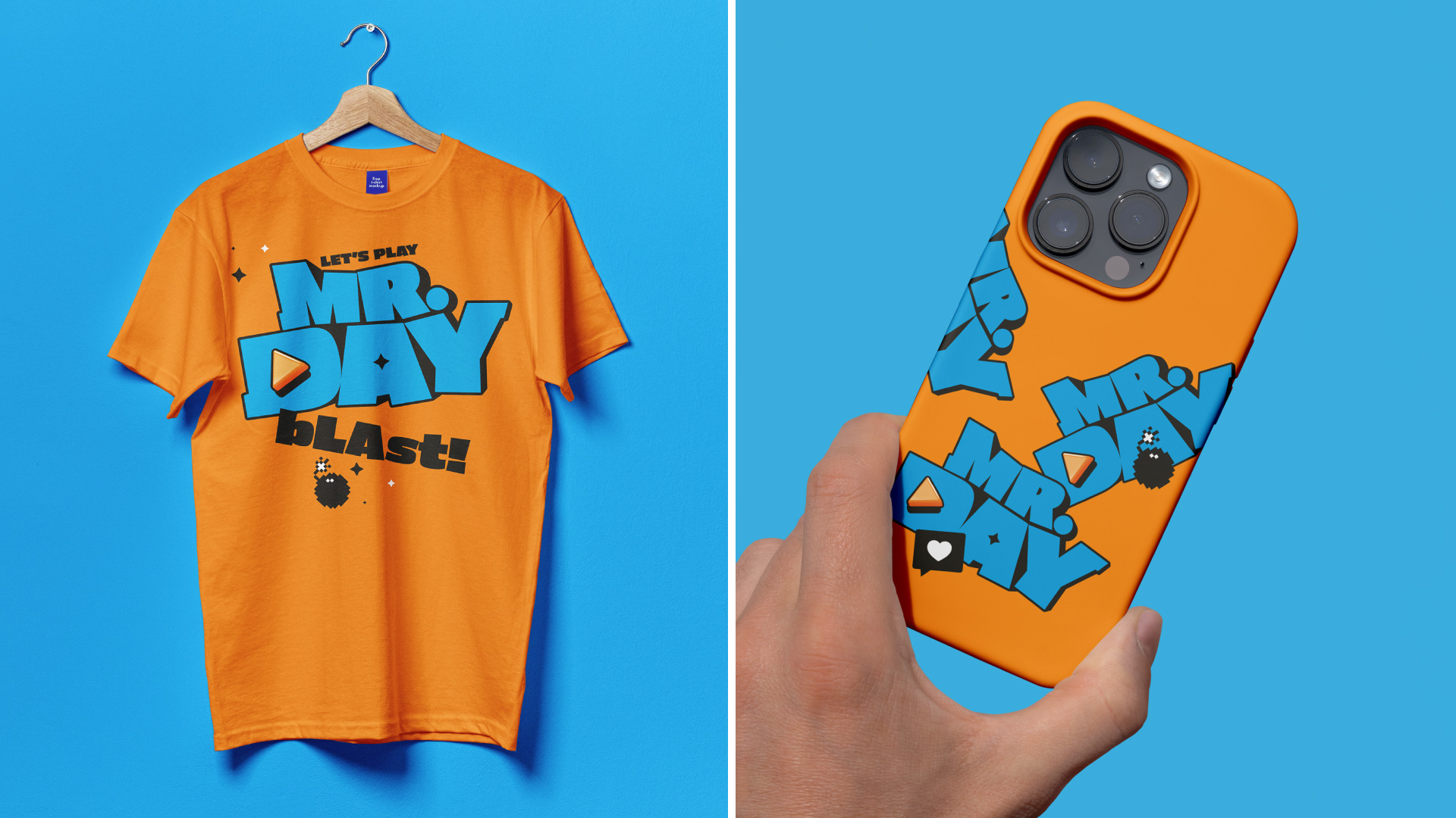
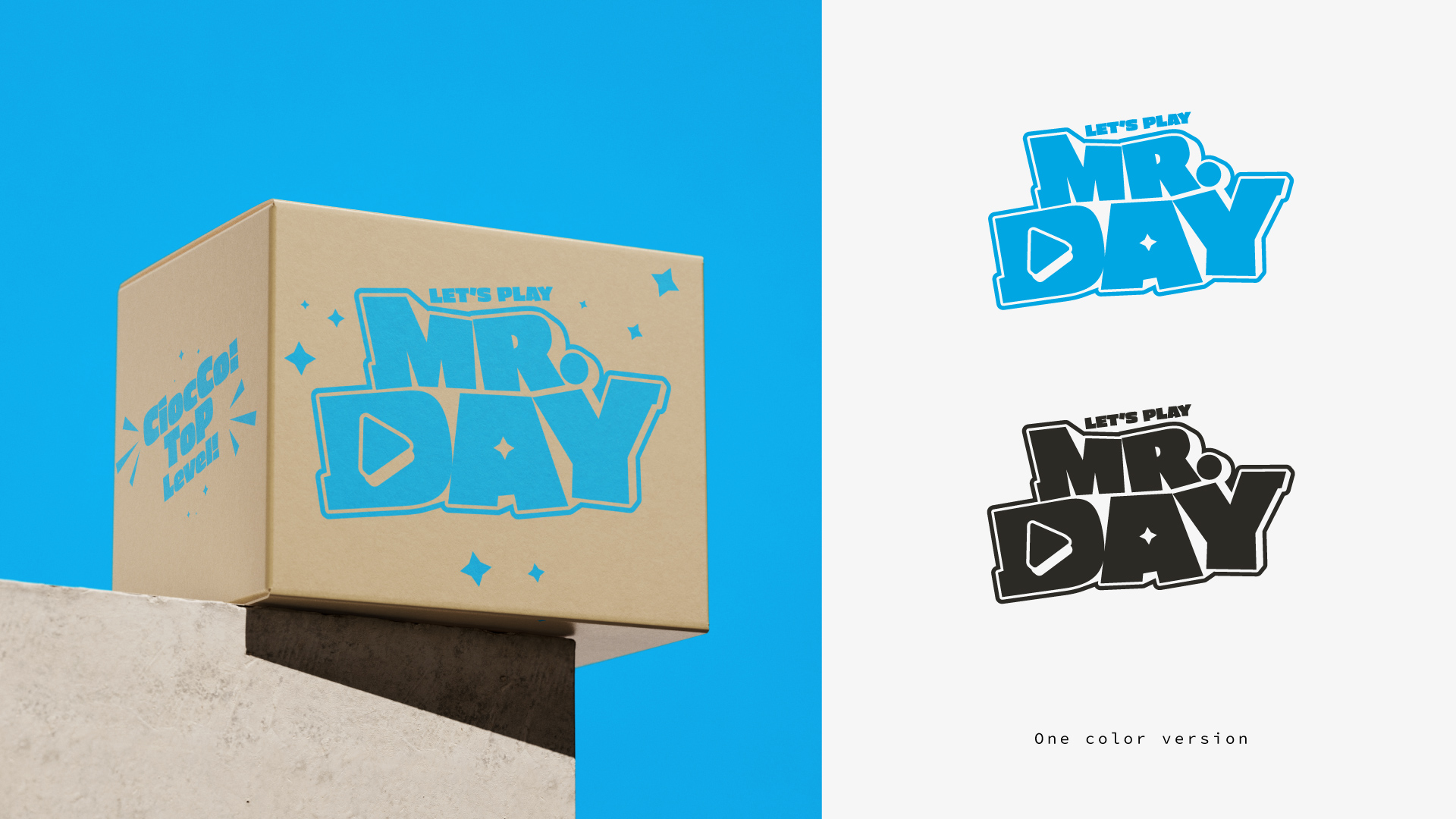
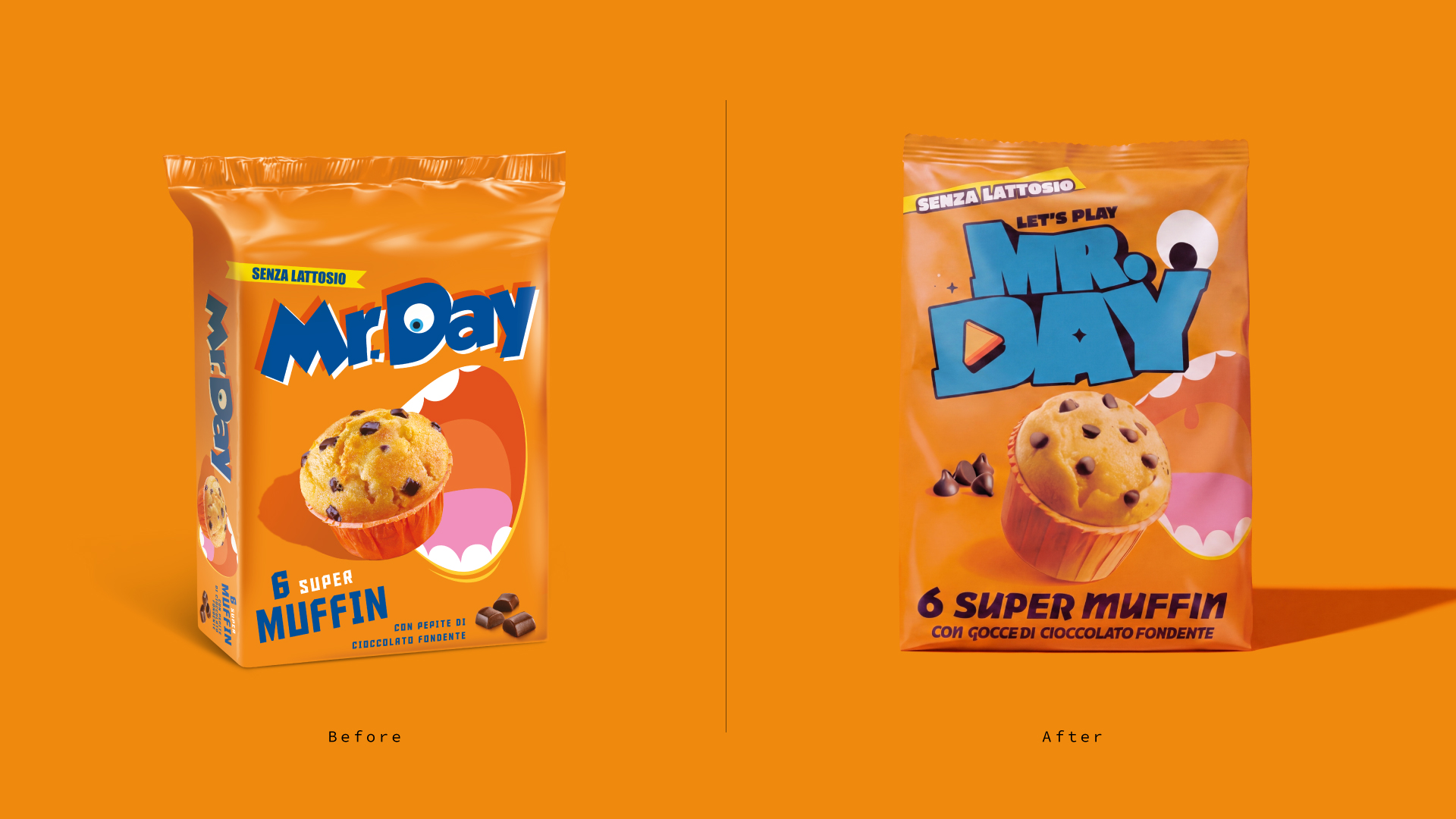
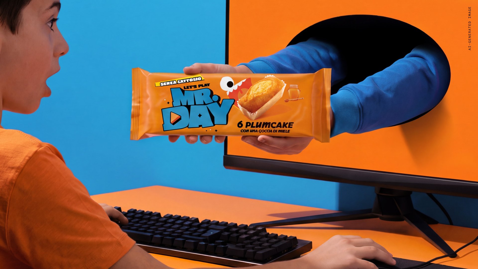
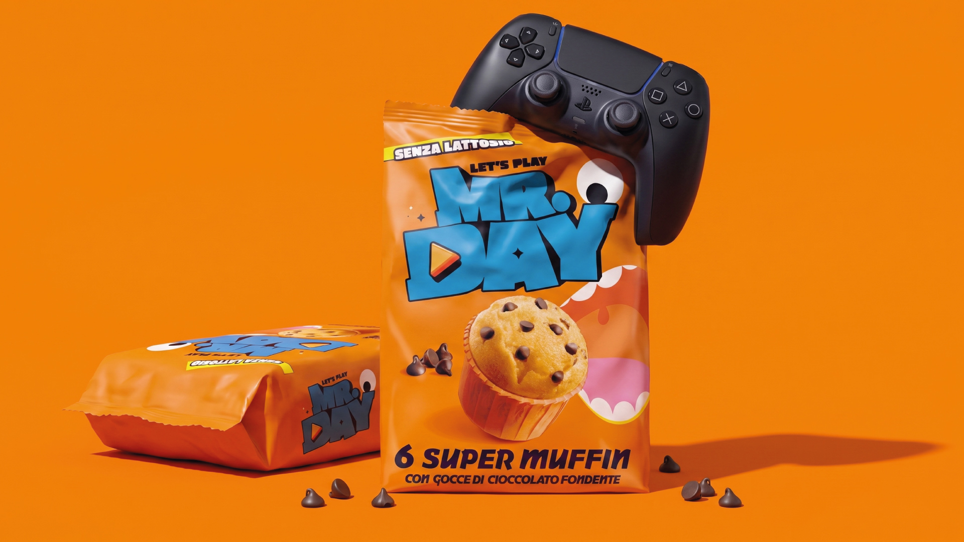
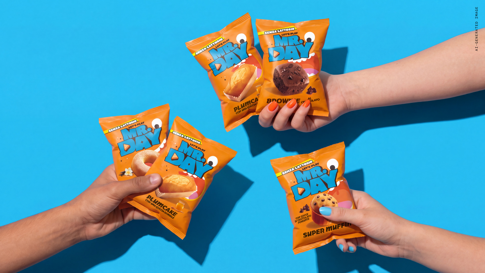
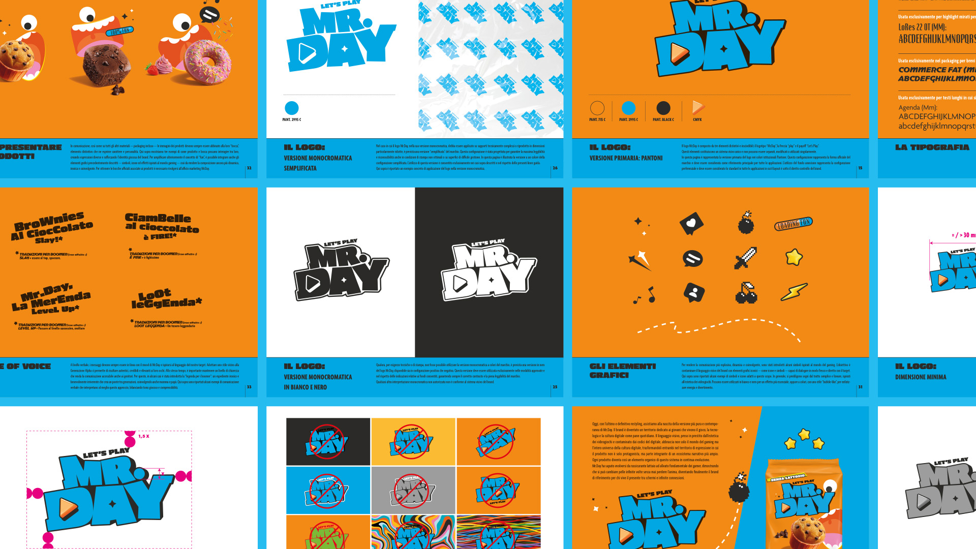
The strategy was built around a clear ambition: create a brand that could occupy a territory of its own — distinctive, recognisable and designed from the very beginning around the language and culture of the new generations. The first principle was simple: make it simple, make it theirs. We immersed ourselves in the language, codes and behaviours of Gen Z, especially their relationship with play, gaming, social media and self-expression. The goal was to create something that could not simply be copied by competitors, but something unmistakably and uniquely Mr.Day. The second pillar was orange. More than a colour, it became a powerful brand asset: highly visible, instantly recognisable and impossible to overlook on shelf. Around it, we created a completely new visual identity, built around a distinctive one-line character that brings personality and energy to the entire pack. The expressive eye and ever-changing mouth turn the product itself into a playful character. Everything was designed to speak the same language: typography, colours, imagery and packaging all draw inspiration from the gaming world, while the formats and experiences extend naturally into digital culture — from augmented reality and online games to competitions and social content. The packaging itself was conceived to live beyond the shelf, becoming part of Instagram stories, TikTok reels and the everyday digital world of its audience. At the same time, the brand’s inclusive product credentials — lactose-free, gluten-free and without milk proteins — became an expression of a broader idea: Mr.Day is for everyone. Not defined by specific needs, but by the desire to share, play and enjoy a break together. After 15 years of evolution, all these elements come together to create something fundamentally different: not simply a new Mr.Day, but a new brand born from everything Mr.Day has learned, becoming the first and only player in a new, distinctive territory created specifically for younger generations. A brand with its own language. Its own codes. Its own world. And, most importantly, its own place in the market. Today, we can finally say that the new era of Mr.Day has begun. Let the games begin.
less...
More...